Google Meet for Android, iOS getting redesigned to look like tab in Gmail
by Abner LiThe future of Google’s enterprise communication services is tight integration with Gmail. That said, there will always be a need for the standalone Meet app, which Google is now redesigning to look like the recently added Gmail tab.
We’re updating the user interface (UI) of the Google Meet mobile apps for Android and iOS. The new mobile UI will have the same look and feel as that of the meeting experience in the Gmail app.
Google Meet today opens immediately to your front-facing camera feed. A bottom sheet has buttons for “New meeting” and “Meeting code,” while sliding up lets you see video calls scheduled in Calendar.
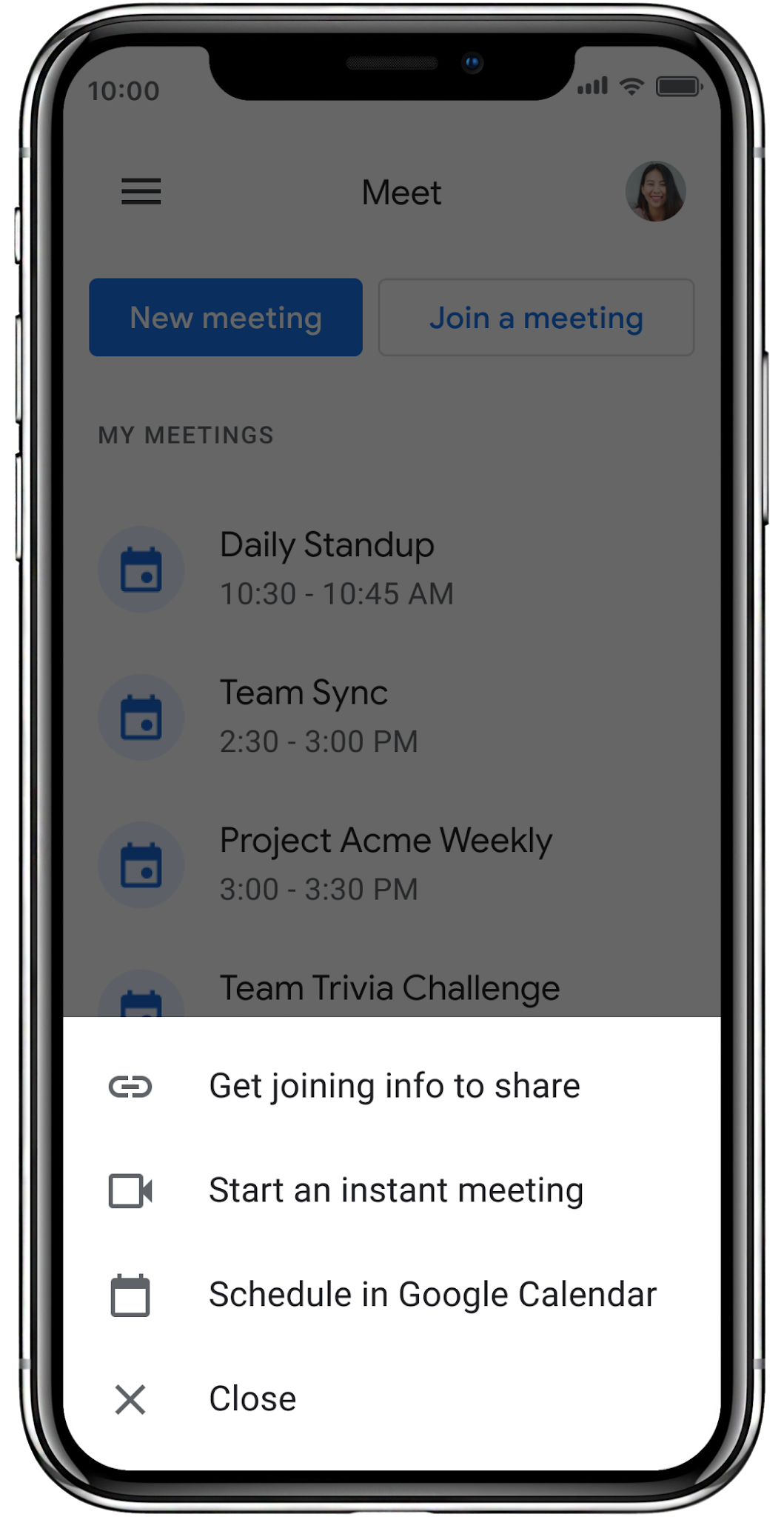
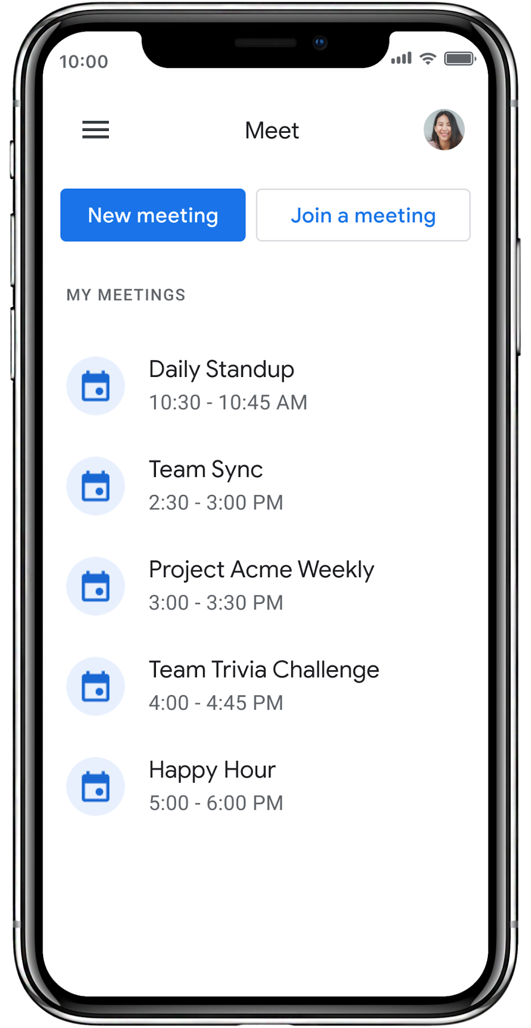
This Google Meet redesign drops the live preview for an immediate “My meetings” list. Like in Gmail, there are buttons for “New meeting” — with three options: Get meeting joining info to share with others, Start a Meet call instantly, or Schedule a new meeting in Google Calendar — and “Join a meeting” above. Your profile image is in the top-right corner, while this design retains a navigation drawer.


Immediately jumping to a camera view was always a bit jarring, and this helps unify the experience. It’s also easier for Google to maintain one design. Some businesses might not use Gmail, but still want to leverage Google Meet for video conferences. For those users, a standalone application is necessary.
This revamp is rolling out on iOS right now (version 45+), and Android will follow up. The redesigned Google Meet will be available for all G Suite and personal accounts.
More about Google Meet
- Google Meet is now available on Chromecast, uses camera, microphone from your computer
- Meet education road map lays out when backgrounds, Q&A, breakout rooms are coming‘
- [Update: ‘Fully available’] Gmail for Android add dedicated Google Meet tab
Check out 9to5Google on YouTube for more news: