Maserati MC20 Could Have Looked Like This
A new render shows what the car could have been.
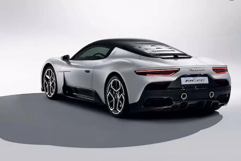
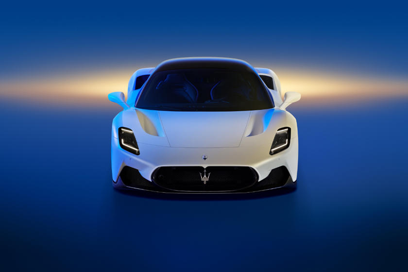
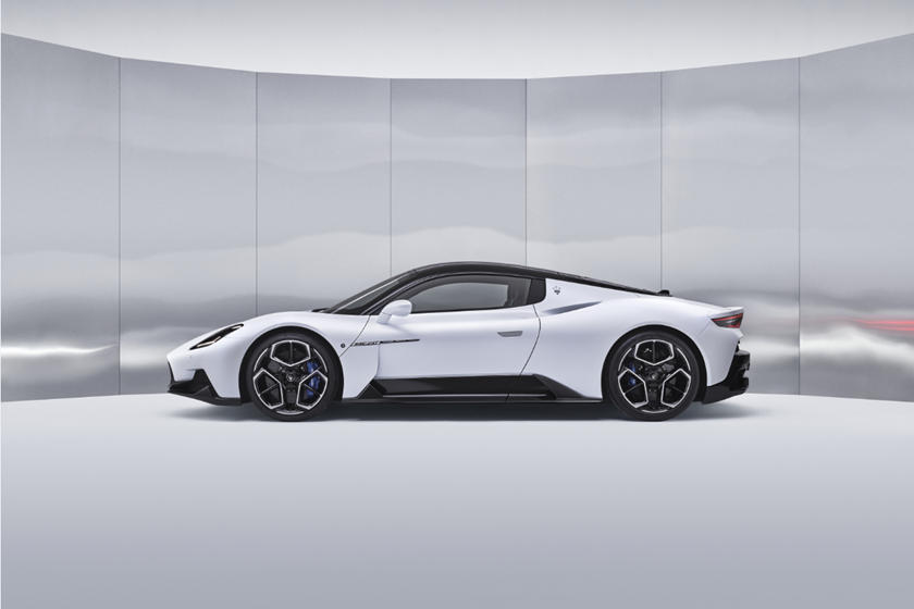
by Sebastian CenizoLet's get one thing straight. The Maserati MC20 is an absolute masterpiece. It looks phenomenal and its astounding V6 engine is pure brilliance. The car as a whole heralds a return to form for the Italian automaker and showcases just what it's capable of. It's also the dawn of a new era that will focus on both racing and electrification, and while we can't find any fault with it based on what we've seen so far, one designer, Nicolas Proulx, has taken a look at the new supercar and decided that it doesn't look quite aggressive enough. As a result, he's put his own spin on it.
https://www.instagram.com/p/CE8D-ReDrNv/
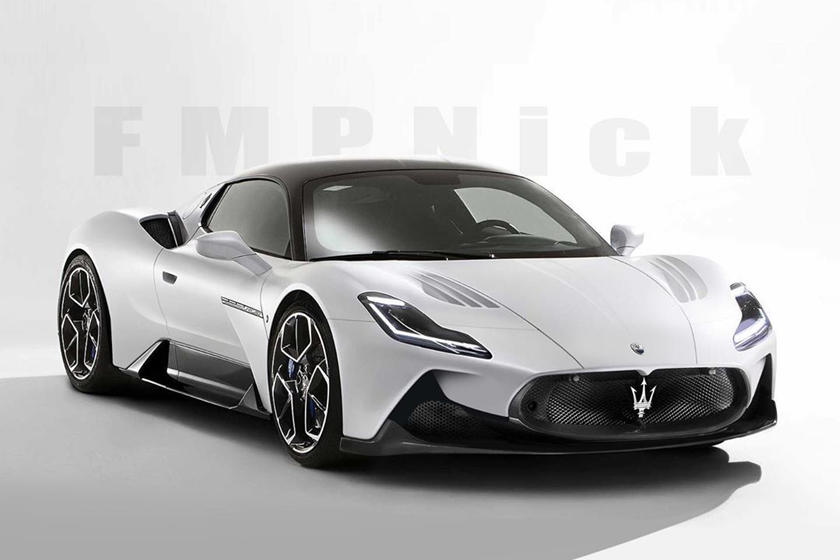
fmpnick via Instagram
He's used the early leaked images of the MC20 instead of the launch images and as you can see, the headlights have been extended and now feature an L shape. In addition, the side intakes on the front fascia are now sharper and extend higher. The doors also now feature a much sharper crease which we assume would house an larger vent rear of the front wheels. The front trunk lines also extend all the way to the grille now, like some sort of tongue. Finally, the vents on the hood have been given some strakes, which we feel don't fit with the smooth lines of the rest of the car too well.
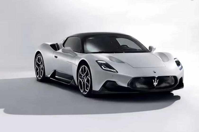
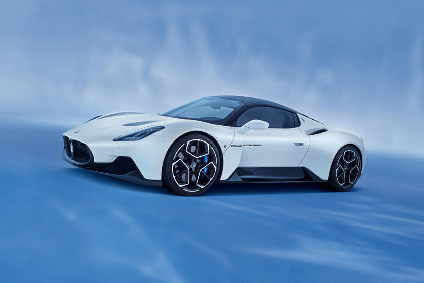
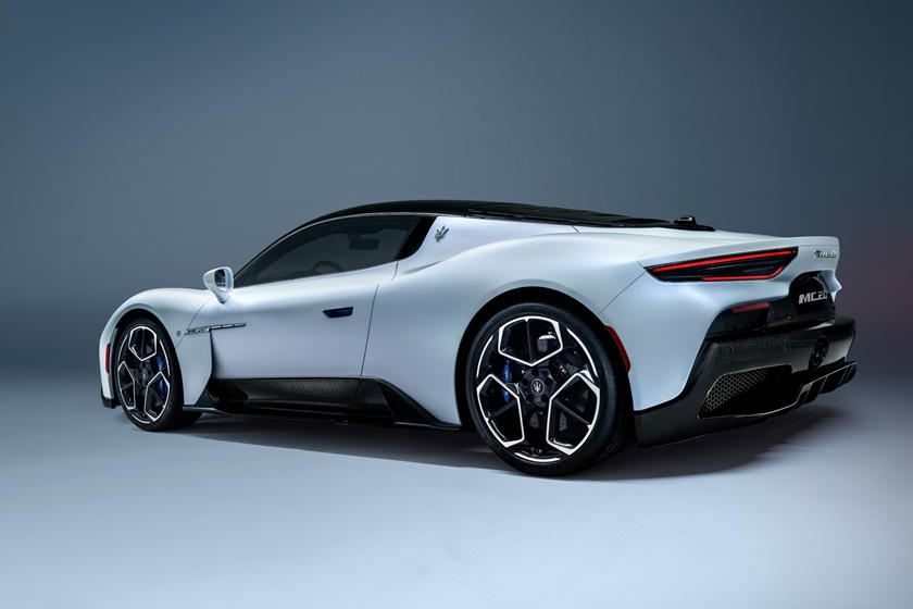
The whole effort is fairly subdued, but we still prefer the original. Sure, the redesign isn't appalling, but the MC20 has been designed to look as smooth and clean as possible. Maserati has included styling elements that are reminiscent of the Ferrari 488 GTB, most notably in the rear quarters atop the car's hips, but the idea with this machine was to create a smooth and elegant design that makes the most of the air flowing over it, while the aero trickery is hidden underneath. Proulx's design doesn't really fit with this philosophy, but it does make the link between the MC20 and the iconic MC12 a little easier to see. Which would you rather have?
