Google ruined the quick settings panel in Android 11
Why are you hiding all my tiles, Google?
by Manuel VonauRead update
- One-row variation
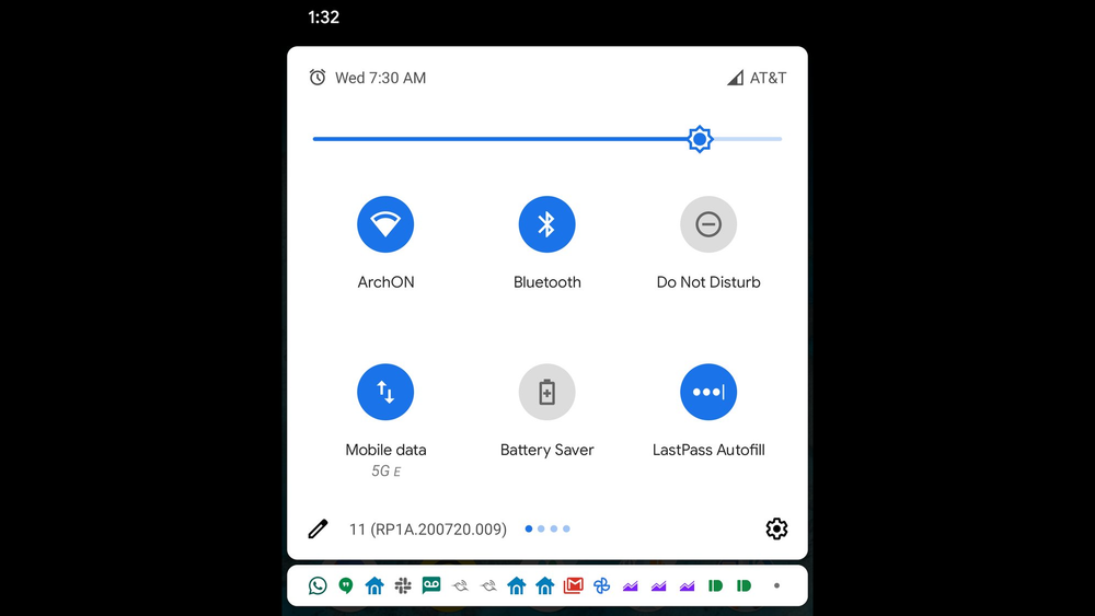
Android 11 has been stable for a bit, and while it brought many improvements to the table, there are also a few regressions. One of these is a small but significant change to the quick settings tiles. Compared to earlier versions of the OS, Android 11 only displays two rows instead of three, even when the new media player isn't in use.
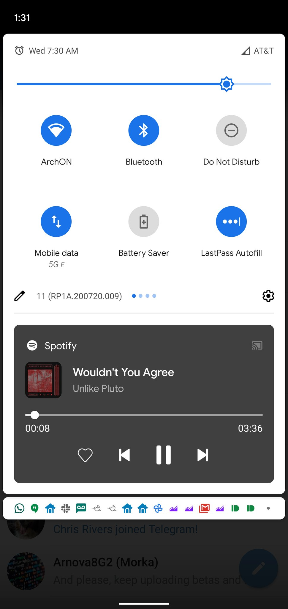
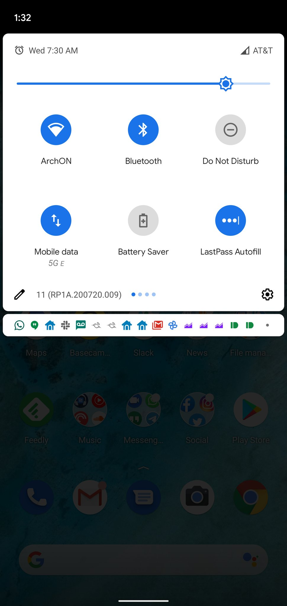
Even when the media player isn't active, Android 11 limits you to two rows of quick settings tiles.
To be clear, I don't mind the reduction of quick settings tiles to two rows while the new media player is active — it makes sense to save some space in that instance, as there simply wouldn't be enough room on smaller screens to comfortably fit three rows of tiles and the player. However, there's no reason to leave the quick settings in their condensed state when you don't have any media playing — there's more than enough space to display three rows.
A lot of people on the internet seem to agree, including our own Artem Russakovskii. Someone even reported the problem on the Google Issue Tracker and received an answer from a Google employee, but not the one we were all hoping for:
Status: Won't Fix (Intended Behavior)
03:28PM
Showing two rows on fully expanding the quick settings is working as intended in Android 11, to reserve space for the new media player that appears in this space.
I can imagine that Google wants to keep quick settings tiles consistent no matter if there's media playing or not — once you expect to find the third and fourth row of tiles on the second page, you might have to readjust every time you dismiss all of your media player panels. But even if that's the reasoning behind the decision, the implementation still seems half-hearted at best. When the meager two-row quick settings are expanded, all of your notifications are hidden, making the pulled down panel look comically small and cut off, like it's missing more content.
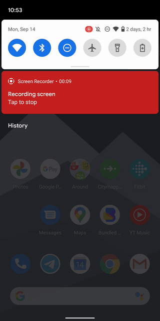
Pulling down the quick settings doesn't give you access to anything else than what's already there.
While the reduction of quick settings tiles is a small change, it makes the experience significantly worse. Only having access to six buttons at a time is limiting, especially since you don't gain anything from pulling down the quick settings panel anymore. You can see the same six shortcuts in the small row atop of your notifications anyway. You now need to swipe to the second page if you want to access other options.
With this change in place, I'm really starting to like Apple's approach to Control Center, the iOS quick settings pendant. You can see a ton more shortcuts at a glance by default, and that's with a media playback tile included. Let's hope that Google can come up with a more thoughtful approach, too.
In the meantime, you could give a third-party app like Material Notification Shade a try, though these applications are generally finicky and often don't feel very native.
UPDATE: 2020/09/14 10:26am PDT BY MANUEL VONAU
One-row variation
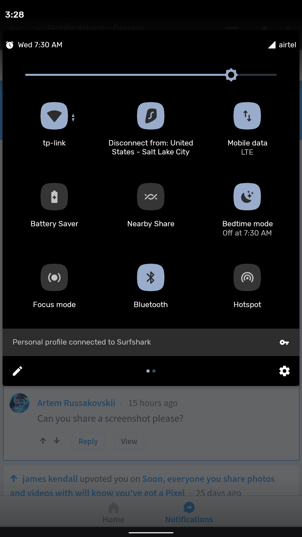
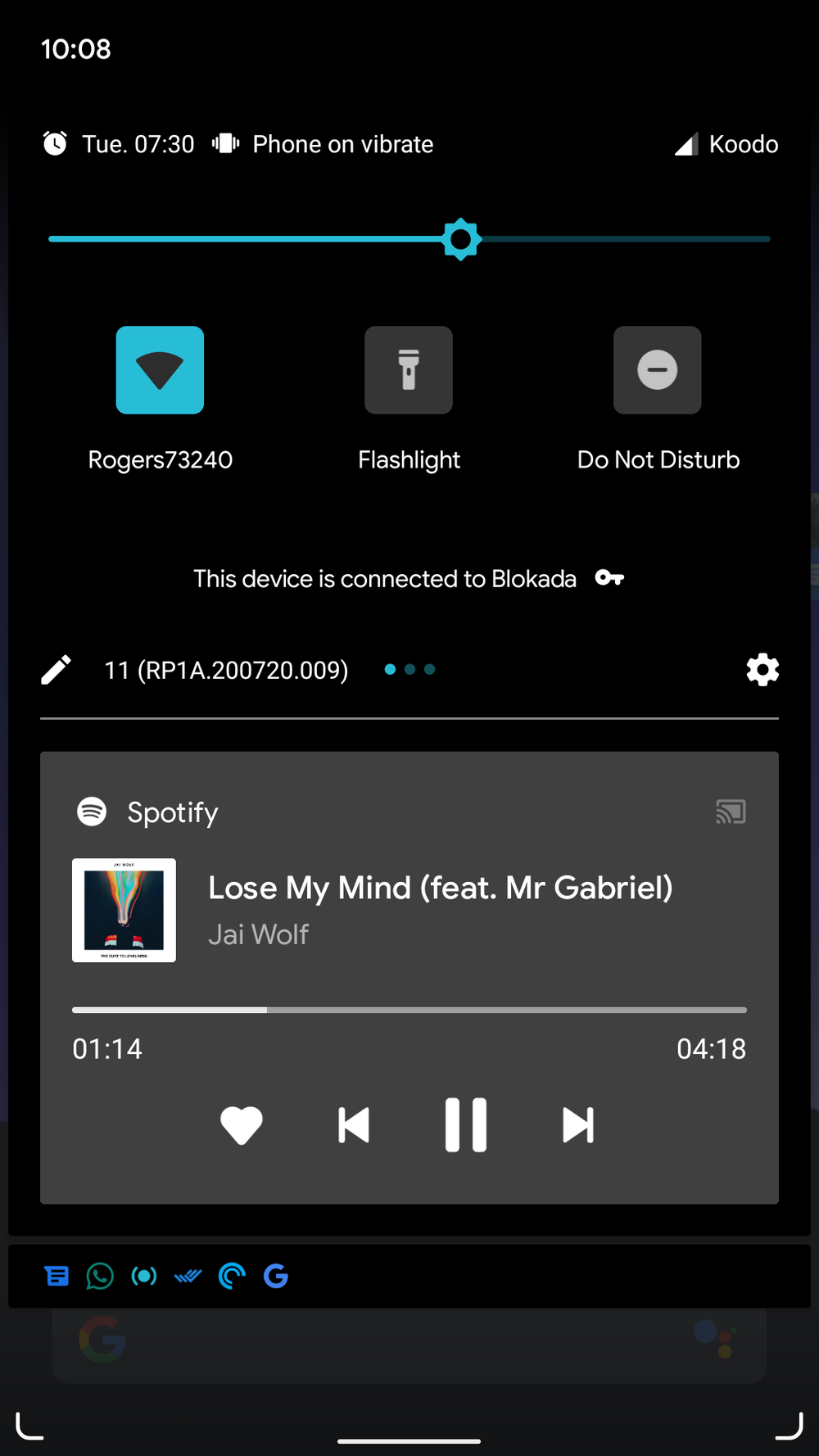
Left: Android 10 (Thanks, Drakenoid). Right: Android 11 (Thanks, Padster).
A commenter down below pointed out that the quick settings panel is reduced to one row when they activate their VPN on their Pixel 2 while the media player is active, which is an even worse regression. It seems like only older devices with more classic aspect ratios are affected, as we couldn't recreate the problem on any other phone but the Pixel 2.
Source: Google
Thanks: AD_LB
Alternate Title: Local man upset at corporation for hiding his buttons